
SERVICE SAFARI

How might we improve the retail experience of trying & buying Vision Pro?

Created by: Lyndsey Fisk
As you step into an Apple Store, your eyes land on the Vision Pro. It’s elevated, glowing, impossible to ignore.
What follows isn’t a demo. It’s a five-stage journey through awe, excitement, confusion, and, at times, uncertainty.

I'm Lyndsey Fisk, I produce ecosystems customers love.
Note: This is intended as a sample of thinking, without known constraints or decisions frameworks the Apple team have already established.

1. DISCOVER

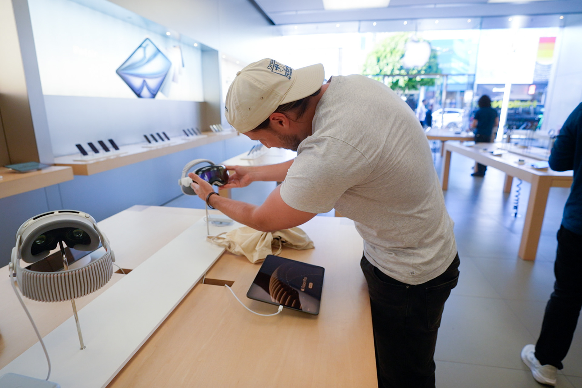
Apples Vision Pro display
I was not supposed to be grabbing that.
During my time in-store I observed three other people make the same mistake before being corrected by staff. Red cheeks. A sheepish exit. I later learned some people have attempted to dismount the device and accidentally broke it.
During my time in-store I observed three other people make the same mistake before being corrected by staff. Red cheeks. A sheepish exit. I later learned some people have attempted to dismount the device and accidentally broke it.
The signifier is the challenge. Every device in the store establishes a principle of negative space, generating focal points that feature products ergonomically positioned to invite touch. Tilted screens, phones on soft magnetic mounts, everything says 'pick me up'.
The Vision Pro follows this pattern, presented identically to other products, except it requires an appointment, facial calibration and a trained staff member to touch. This created a structural tension.
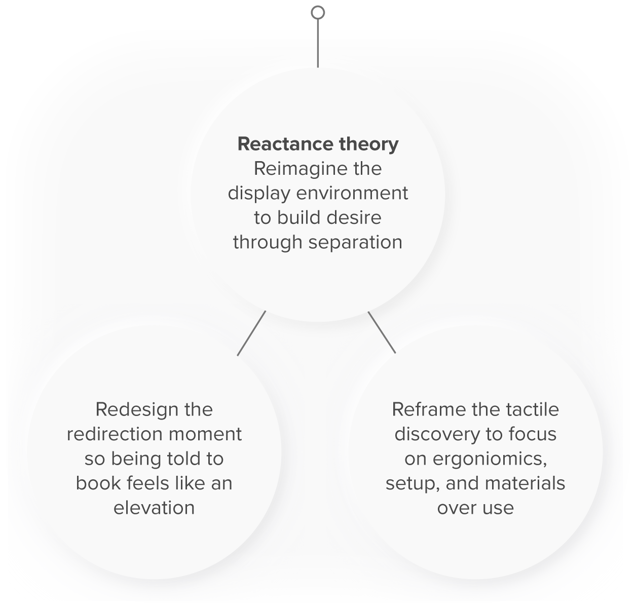
When an object's form implies an affordance it cannot fulfil, the customer absorbs the cognitive and emotional cost. The opportunity isn't to signal "don't touch", it's to reframe discovery itself, moving from touch-first to anticipation-first.
Constraints: This problem requires deep consideration. Open tactile discovery is a powerful retail mechanic, however it is difficult to to pair with a product that requires hygiene protocols, facial calibration and assisted onboarding. Any solution that ignores that constraint will create a new problem. The opportunity is to invent a new discovery model for a product category that has never existed in retail before.
How might we...
Signal that Vision Pro is a booked experience before the customer reaches for it?

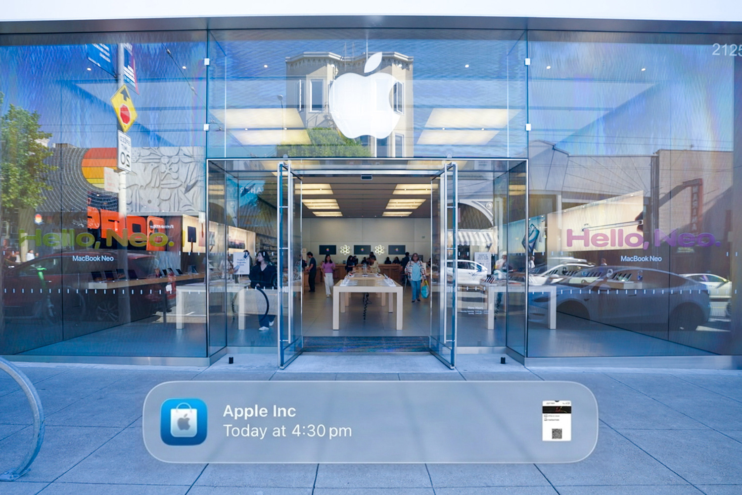
2. BOOKING

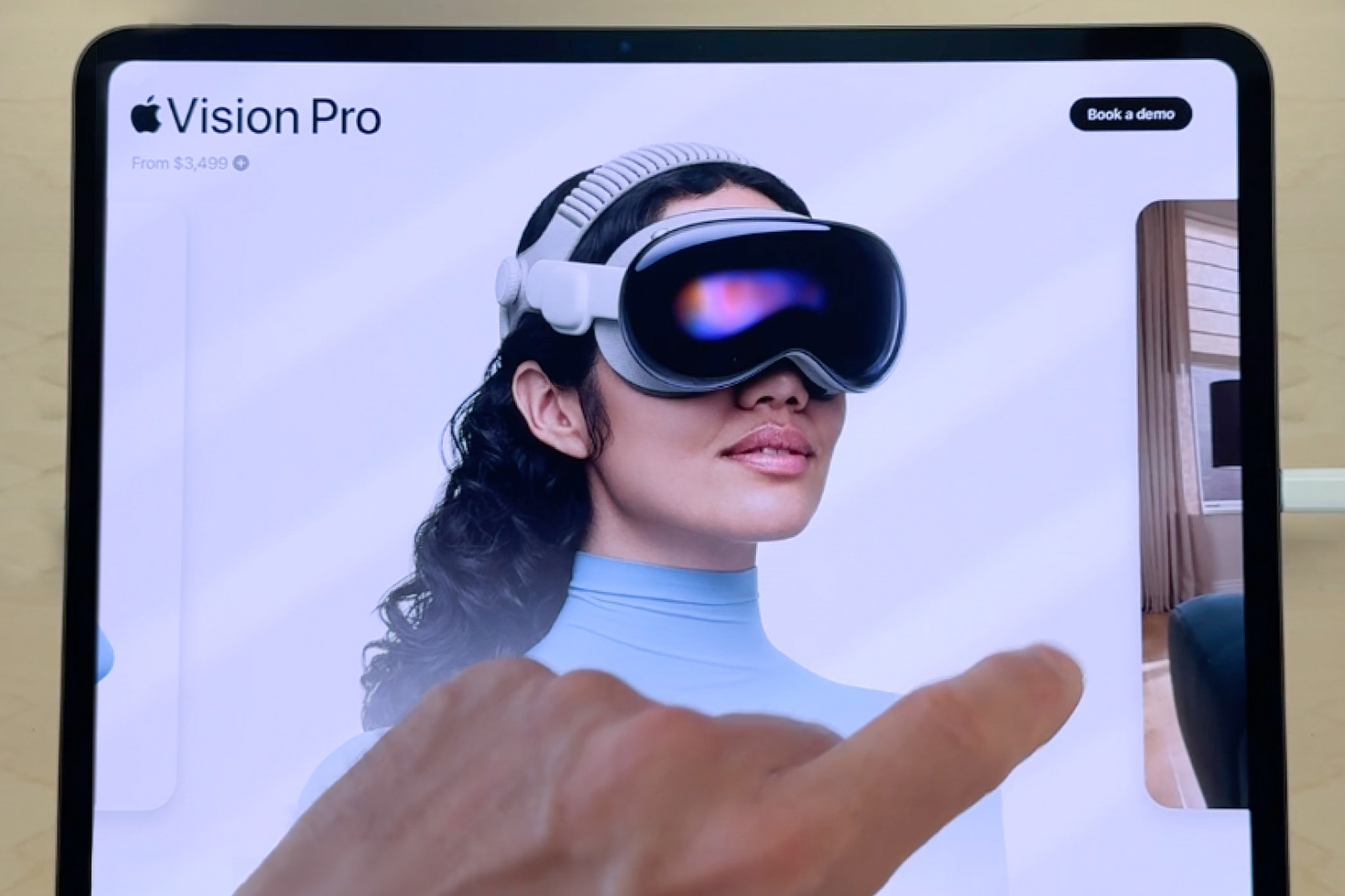
An iPad resting below the Vision Pro
Below a well produced promotional video, and inside an interactive exploration that highlights several product use cases sits a booking button. This is the button to get your hands on a Vision Pro.
What follows is clever booking flow that also shows the hallmarks of a product still finding its feet. Moments of genuine delight sitting alongside operational friction. The observations here aren't a criticism of execution. They're a signal of where this part of the experience has room to grow and iterate.
What follows is clever booking flow that also shows the hallmarks of a product still finding its feet. Moments of genuine delight sitting alongside operational friction. The observations here aren't a criticism of execution. They're a signal of where this part of the experience has room to grow and iterate.
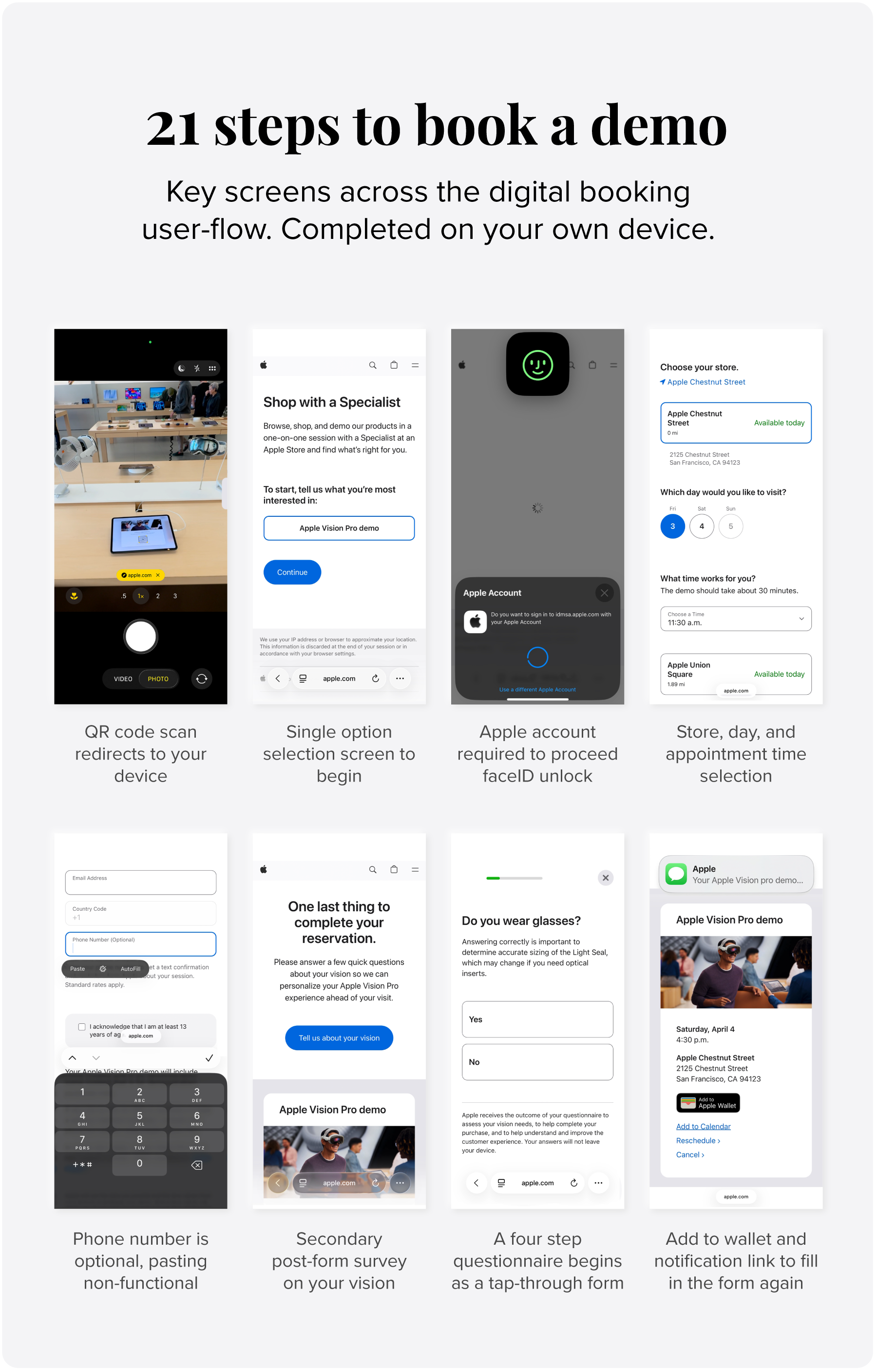
The friction I experienced included a QR code that asks you to swap devices mid-flow. A phone number field that doesn't allow paste. And a follow-up prompt to complete a survey that'd already been filled out. Within it, there was also moments of magic. Add to Wallet. Face ID to pre-fill your name. Apple does this well.
The real tension I see sits between the experience you're about to have and the process of getting there. One is highly immersive. The other leans towards operational.
Every additional step between intent and confirmation is an opportunity to reconsider. The research is consistent: perceived effort in a pre-purchase flow correlates directly with dropout and buyer's remorse.
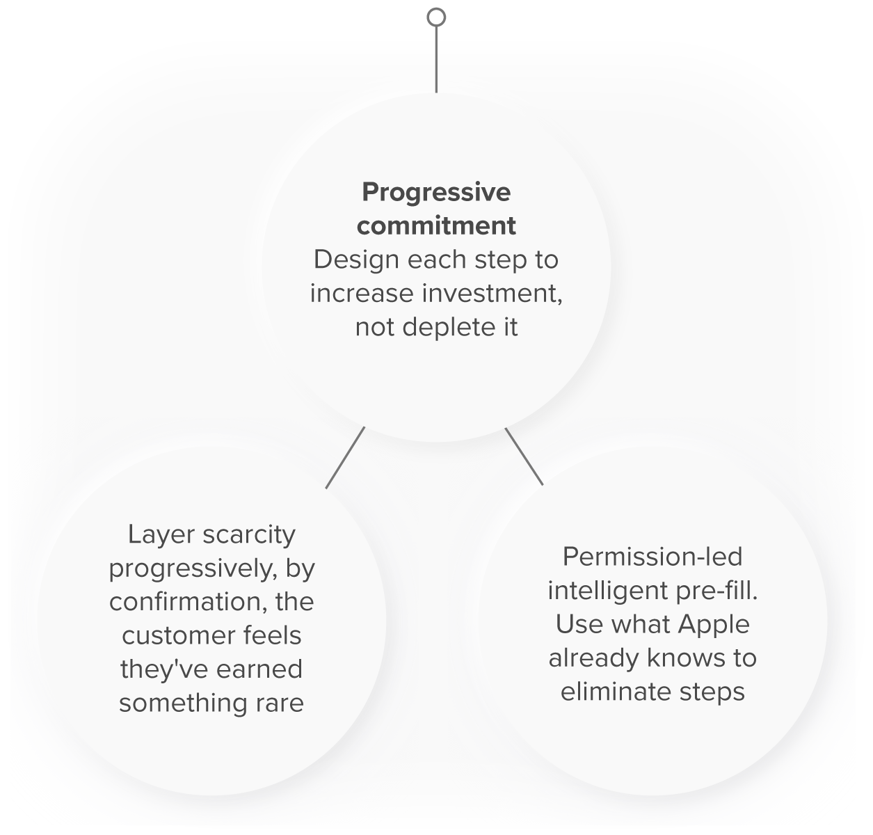
Constraints: The 21-step flow isn't carelessness. It reflects the operational requirements of booking a complex assisted experience, vision surveys, time slot availability, location confirmation, consent. It isn't the number of steps. It's that the steps at times feel like effort rather than anticipation. The opportunity I saw is choreography, not necessarily simplification.
How might we...
Make each step feel like it's building toward the experience of the vision pro experience itself?

3. ANTICIPATION

A contextual wallet reminder appears on the day
The space between booking and attending is not dead time. It is an experience.
It is the moment Apple knows you exist, knows you made a decision, knows you chose this over a film or an afternoon with friends. And it is almost certainly the moment of highest engagement in the entire journey, research on service anticipation consistently shows that customers are more willing to take actions, share information and invest emotionally in the window immediately after booking than at any other point in the pre-visit journey.
What Apple doesn't appear to know yet: why you're there.
That's the biggest missed opportunity in the journey. Without intent data, every demo is attempted to be curated on the spot. Before the staff member greets you they have no context for whether you're a developer exploring spatial computing, a creative professional considering a workflow shift, or someone who simply wants to experience something extraordinary before deciding it's not for them. Each of those customers needs a fundamentally different experience, and we could use the space between booking and arrival to explore it with them.
Anticipation shapes interpretation. How a customer feels arriving at an experience determines how they process it. Prime the customer and you prime the experience, a well-designed anticipation window doesn't just fill dead time, it does active emotional work that the demo itself can't do.
Constraints: Intent capture requires trust. Asking customers why they're coming risks feeling intrusive if framed as a survey and irrelevant if positioned as administration. The design challenge is creating a mechanism that feels like Apple is preparing something personalised for you, not profiling you. This is a content and interaction design problem as much as a data problem.How might we...
Use the anticipation window to understand intent and build desire before the customer walks back through the door?


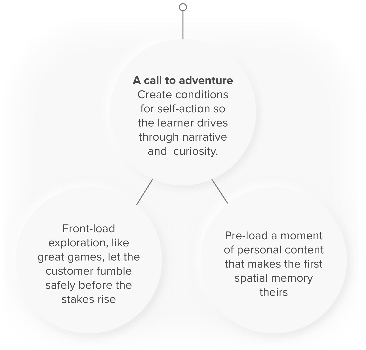
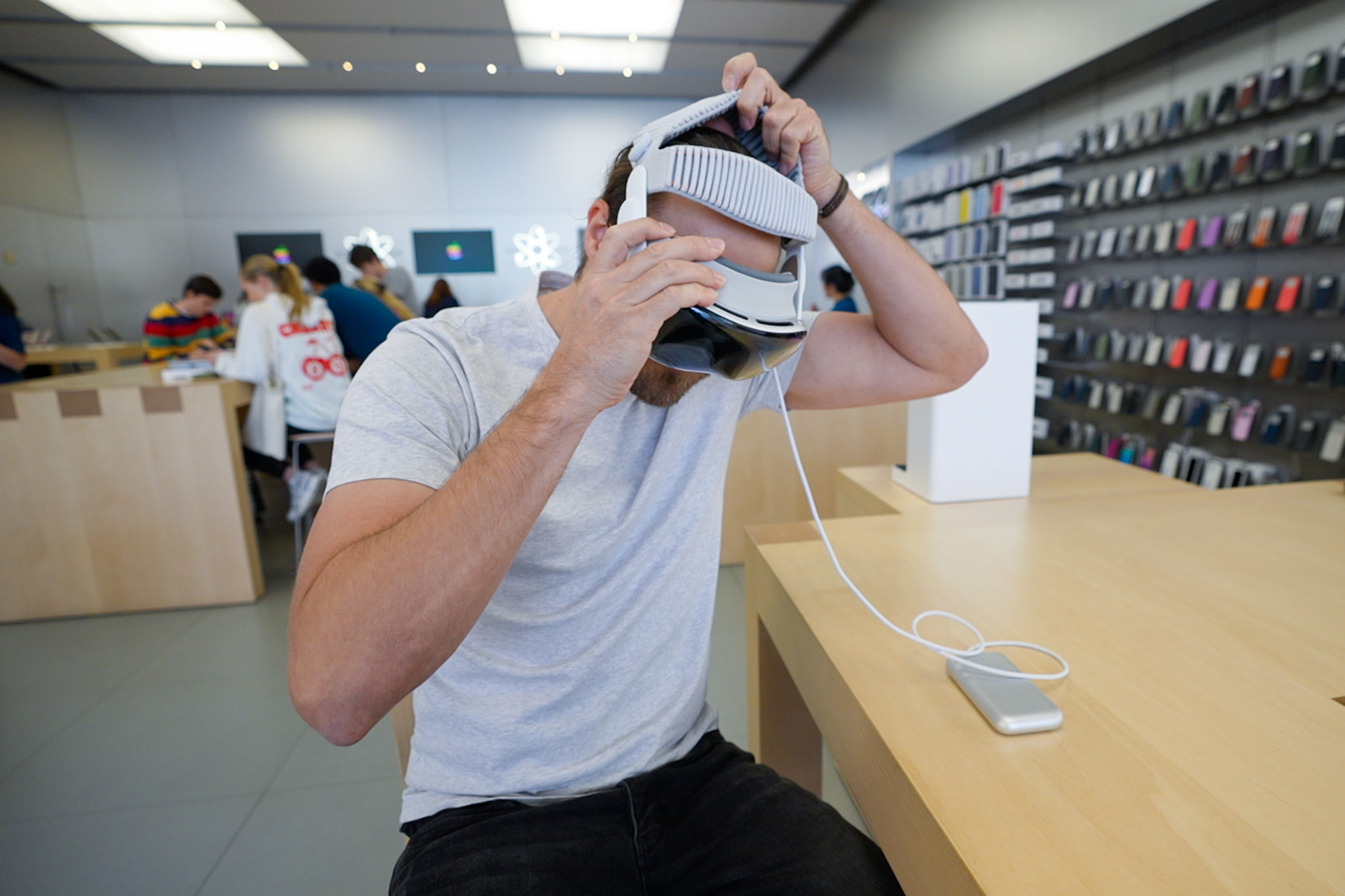
4. DEMO

The demo begins with a staff member's iPhone. As you stand in the store turning your head from side to side for facial scanning, the anticipation mounts. Where is it? When do I get to put it on?
Then it emerges. A Vision Pro brought out from back of house on a felt lined platter.
It's a selling ceremony, a technique borrowed from premium brands like Rolex and Tiffany. But having already handled the mounted display model, the peak moment of the grand unveiling had already partially passed.
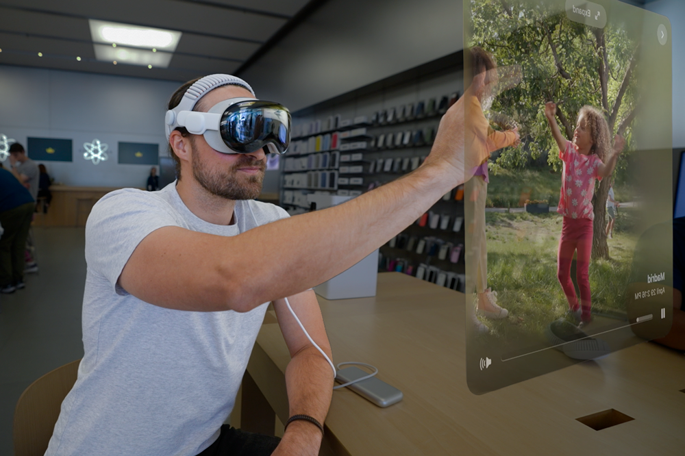
Guided to learn basic hand gestures using the photo app
A guided onboarding teaches basic multimodal gestures, gaze techniques and interactions. Family park videos and birthday photos so high fidelity you can almost reach into them.
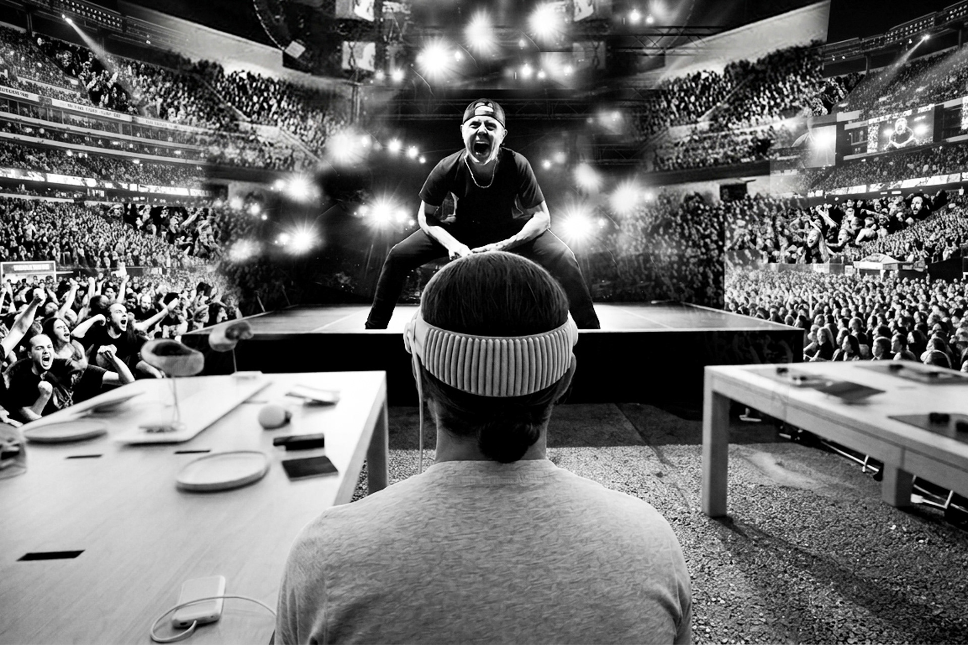
Metallica immersive concert (AI enhanced collage of the experience)
Then Metallica in concert. By far the most immersive moment in the demo. Now you are in it.
The technology is remarkable. Getting here was not completely seamless.
The 30-minute session is operationally complex. Staff manage two devices simultaneously, one mirroring your display, one running the session script. When it works, it's invisible. When it doesn't, you feel them trying to figure it out. The product is so immersive that even a small break in the service registers significantly. That's a signal of how high the bar has been set, not a criticism of the people delivering it.
The in-app content is technically extraordinary. One surprising consequence of that was that watching strangers families intimately celebrate a birthday in full spatial immersion whilst you sit in a public store feels unexpectedly awkward. The medium is personal. The content isn't yet.
Service blueprints: when backstage operations leak into the frontstage experience, the customer absorbs complexity the organisation hasn't yet resolved.
Constraints: Staff fluency will always vary by individual, tenure and training cadence. Script-dependent delivery is a training design problem as much as a service design one. Personalised in-app content introduces rights, privacy and production complexity at scale. Neither is a quick fix, both require organisational investment upstream of the customer experience.
How might we...
Create a demo experience so fluent that discovery feels entirely the customer's own?

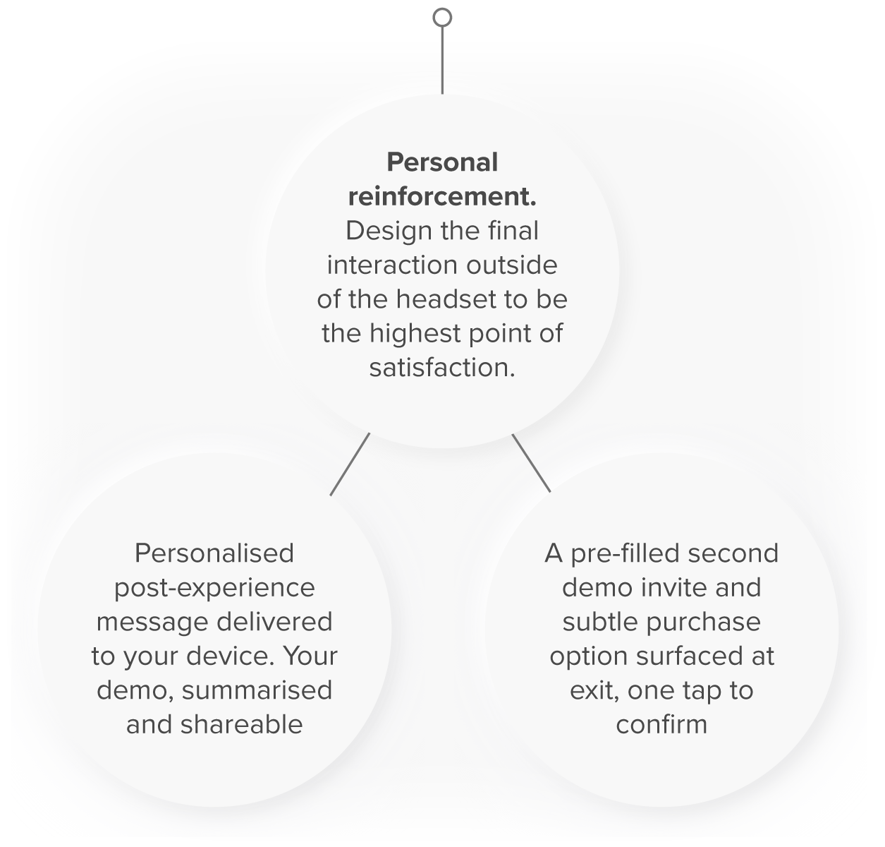
5. EXIT

Conclusion of the Vision Pro demo
You've just experienced one of the most remarkable moments technology has to offer. It deserves pause, however I did experience that pause turns into silence.
No artefact. No photo. No follow-up. To some extent it felt like going to Disneyland and leaving without a photo of your ride. You know something extraordinary happened, but you have nothing to show for it. The staff were warm and genuinely personable, but does the exit stop short of the memory it just created? And second demo session can be organised, but there's no clear way to make that happen before leaving.
The last moment of an experience is disproportionately weighted in memory. Currently the Vision Pro demo ends in silence. That silence is the most remembered moment.
Constraints: Exit design at scale requires consistent staff choreography that doesn't feel scripted. A shareable artefact introduces production, personalisation and brand considerations. The second demo pathway exists but isn't surfaced, whether that's intentional or a sequencing gap in the staff flow is the first question to resolve before redesigning the exit.
How might we...
Give customers a lasting Vision Pro experience that converts excitement into intent?


Fifteen opportunities mapped across five stages. Each one a starting point, a thread to pull, not a complete solution.
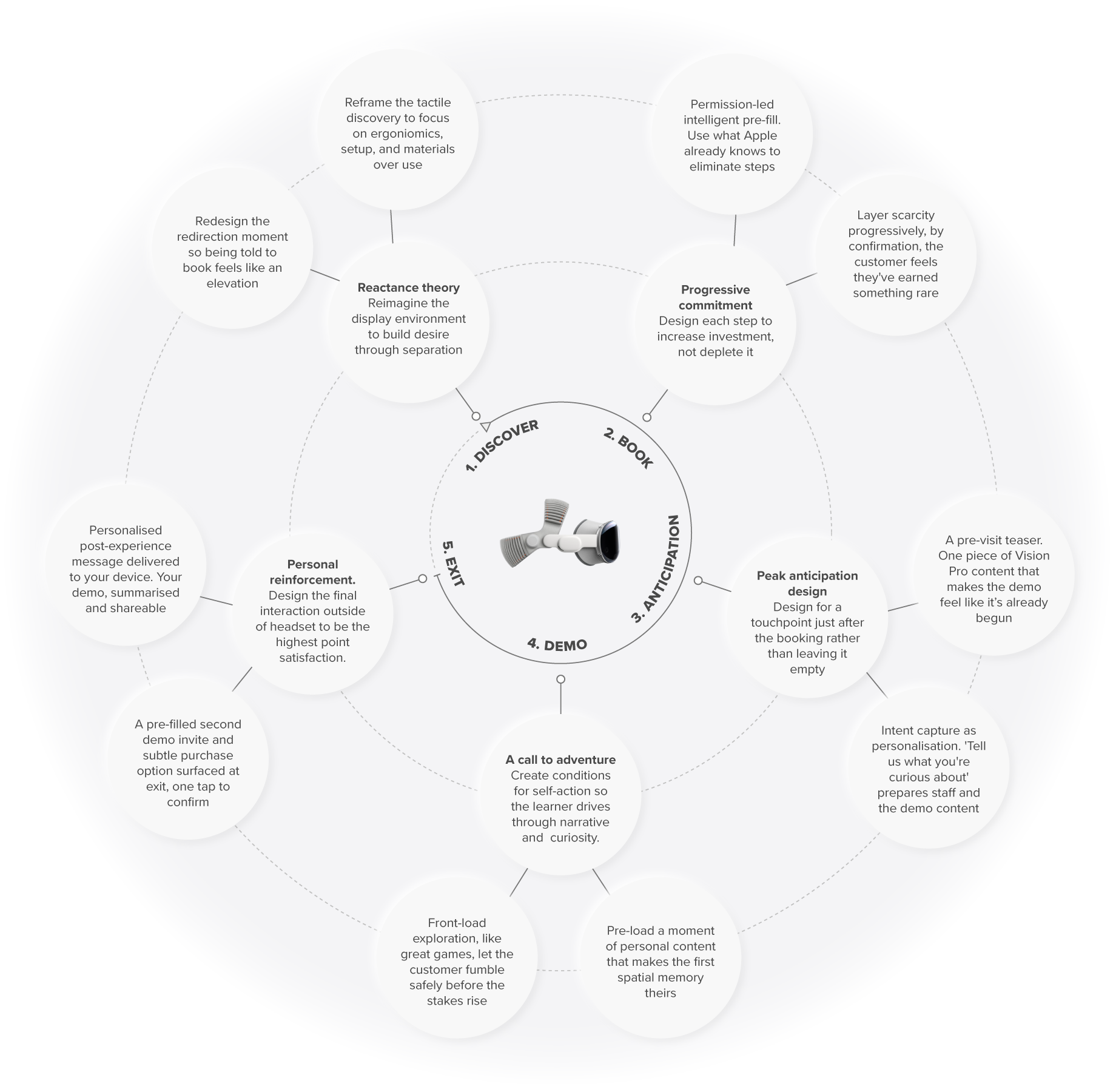
Opportunity map for the Vision Pro trying and buying experience - Created by Lyndsey Fisk
Customer and commercial impact
Opportunities: reduce the friction, increase the intent to buy, and increase organic reach. And for the customers whose lives Vision Pro could genuinely transform, the creative professionals, the healthcare providers, the educators, a better experience means thousands more people discovering that sooner.
The customer experience is the commercial strategy. Research shows companies that prioritise experience grow revenue 1.7x faster and generate 2.3x more customer lifetime value.
Every gap mapped here isn't just a design opportunity. It's revenue, and longterm customer loyalty.


Whilst I saw opportunities for the experience to grow, my hat goes off to the the teams that designed these experiences s they are. There are no blueprints for the in-store interaction, marketing, and educational experience design for spatial computing.
Every paradigm-shifting product arrives before the ecosystem around it is ready. That's not a weakness, it's what drives the opportunity to break new ground and enrich peoples lives.
Cheers,
Every paradigm-shifting product arrives before the ecosystem around it is ready. That's not a weakness, it's what drives the opportunity to break new ground and enrich peoples lives.
Cheers,
Lyndsey.